Author: Kimi Toh

  • Positions through contexualising progress blog

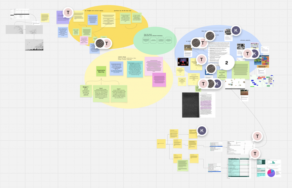
    upon receiving this brief, the first thing i did was make a spreadsheet, which, in hindsight, was a really bad way to box me into certain themes and ideas. this was my original list of references; i threw every reference that felt even vaguely relevant into it. nostalgia texts, internet culture essays, visual culture theory, practice-based projects.

    i also added a column called “scale”: macro for references that speak broadly about culture and history, micro for ones that are more inward-focused, about particular traces and particular people rather than big sweeping arguments.

    i think i thought organising the references would make me feel like i had a plan. it did not make me feel like i had a plan. what i actually had was a huge list of things i’d half-read and no idea how any of them connected to each other or to what i was making. i kept staring at it hoping it would tell me something.

    i genuinely could not articulate what my project was about beyond “memory i guess??”

    the thing is, and i only realised this much later, the spreadsheet actually was telling me something. when i looked at which references i kept returning to, which ones felt urgent rather than just academically relevant, they were almost all the micro ones. cameron’s world, which is about recovering specific geocities pages made by specific anonymous people. lialina, who writes about what the internet remembers and forgets about ordinary people who were never famous. steyerl on specific degraded images. the macro texts kept sliding off my project. they didn’t have anywhere to grip.

    i do think that the spreadsheet also helped me look inward and define my positionality; that it was always on the micro scale; first-person testimony instead of sweeping theories.

    but i couldn’t see that yet. i just saw a spreadsheet and a deadline.

    at my tutorial, i tried to explain what i was working on and it came out as word soup. my tutor zarna listened and then told me to take a step back. stop looking at the objects, she said. look at what’s underneath them. what connects the lotus pond and the tamagotchi and the nintendo ds?

    i said memory. she said look further.

    she recommended two texts: the internet does not exist edited by aranda, wood and vidokle, and the internet exists on planet earth by mindy seu.

    i went away and read both, and something cracked open. the devices i’d been drawing from memory weren’t just objects. they were all portals — the nintendo ds had pictochat, the flip phone had a browser, the ipod had a music store. and the internet i was reaching through those portals was a completely different internet to the one that exists now.

  • Positions through iterating progress blog

    i knew from reading the brief that i wanted my iterations to be illustration-based, so i chose a flower from a study that i did during methods of investigating to be the source of my iterations.

    i also knew that if i didn’t set a condition for my iterations, i would be drawing things randomly and arbitrarily, thus i thought a reasonable condition was:

    • look at the previous iteration for 5 seconds
    • hide previous iteration
    • draw from memory within 2 minutes
    • no erasing
    • repeat x100.

    i was quite interested in feedback loops as my methods of iterating project involved a lot of experimentation with machine feedback loops, ie., riso –> computer, but i wondered what would happen if my hand was the feedback loop.

    some reflections from this exercise:

    • the first 5 iterations were the most distinct.
    • by iteration 30, my hand had learnt how to draw this flower with muscle memory and i noticed i wasnt quite looking intently at my previous iteration and trying to remember every detail with my eye anymore
    • by iteration 50, i dont think i even had to look at the previous iteration for 5 seconds
    • by iteration 80, all my flowers started looking really similar

    i realised that this exercise became a self-portrait of my memory, not just a human feedback loop, and i really loved seeing the way that my flower evolved when i played my drawings back as an animation. i thus decided to make my publication a flip book as to obtain the same effect.

    Screenshot

    around that same time, i was going down a rabbit hole on the concept of ‘anemoia‘, which a concept coined in the dictionary of obscure sorrows as the feeling of nostalgia for a time you never actually lived through. it’s a strange sensation because it has no rational basis. you can’t miss something you never had. i kept seeing the same name cited in everything i was reading: svetlana boym. so i read her.

    her distinction between restorative and reflective nostalgia is the part that stuck. restorative nostalgia tries to rebuild what was lost — it wants the original back, faithfully reconstructed, as if the loss never happened. reflective nostalgia knows that’s impossible. so instead it dwells in the longing itself. it doesn’t try to fix the gap between past and present. it lives in that gap, and it keeps the damage visible.

  • Unit 2: Positions through iterating written response

    Part I. Annotated Bibliography

    Nara, 2001

    Part II. Line of Enquiry

    My project uses Georges Perec’s method of memory writing as its methodology (Perec, 1997, p.55) : evoking childhood objects and places without reference images, sitting with uncertainty, and forgetting as much as with clarity. Through illustrated fragments, I began exploring personal nostalgia, but the work has since opened onto broader and more uncomfortable questions, such as: what makes something nostalgic, what makes something a trend, and who holds the power to decide?

    Growing up in Bangkok, with one foot in globalised consumer culture and one foot entirely outside it, I find myself drawn to the gaps; the childhoods, cultures, and objects that never make it into the trend cycle. As Y2K becomes a commodified aesthetic driven by people who didn’t fully live it, I am increasingly interested in what gets extracted, what gets erased, and what it might look like to bring the same aesthetic intentionality to experiences that have never been granted that kind of value. These are questions this project has opened up rather than answered.

    References

    Perec, G. (1997) ‘The Street’, in Species of Spaces and Other Pieces. London: Penguin Books Ltd, pp. 46–56.

  • contextualising studio work progress blog

    for the second week of contextualising, i made a long receipt that mimicks a bureaucratic tone but actually exposes what gets hidden in between silos of data.

    my long receipt

    our group decided to use this as a format to present our final work. at first, i had intended for this receipt to be a printed publication, complete with images and illustrations, however in combining my ideas with my group, we decided that the container for our project should be a website.

    my introduction to …

    . ݁₊ ⊹ . ݁˖ . ݁vibecoding. ݁₊ ⊹ . ݁˖ . ݁

    I’d seen the term “vibecoding” floating around and it felt like something that applied to people who already kind of knew what they were doing. i, however, had the most baseline coding knowledge ever. There is something vulnerable about not understanding the thing you’re making. With Illustrator or figma, even when I’m trying something new, I have enough foundational knowledge that I can diagnose what’s going wrong. With code, I had practically nothing. When something broke, I didn’t know if it was a small thing or a fundamental thing. i felt like every edit i made might have detonated something.

    i started with wanting to keep the idea of materials remaining on earth for many years into the future, so i tried creating a “temporal lens,” where if you clicked a button, the receipt would blur out everything except dates and timelines as you scroll down.

    however, there were too few dates and timelines throughout the whole receipt, so i pivoted to the idea of the entire receipt morphing into a map (very ambitious for someone who knows 0 code, unfortunately :’) ) and as you scroll down the receipt, your cursor functions as a ship, and you are following the trail of e-waste that originated at UAL, to its transfer station at sittingbourne, to shenzhen, and then to the global south, where it accumulates in a pile at the bottom of the map.

    my code for this, however, failed…

    i therefore pivoted yet again, to the idea of waste following the user of the site no matter where they navigated, in order for there be no escape from accountability, the same way the waste itself has no safe destination.

    my first iteration of the waste container!!!

    (very) Slowly, I started to build up enough context that the process of vibecoding felt less like hitting enter and praying and hoping for the best, and more like a back-and-forth of what i wanted to input or fix.

    with the help of my groupmates, we eventually refined the code so that the container moved more smoothly into the pile of e-waste accumulating at the bottom of the screen.

    It wasn’t lost on me that Claude, the AI I was vibecoding with, runs on data centres full of hardware that will one day become the kind of waste we were documenting. I was using one end of the chain to examine the other end. Whether that is poetic or just hypocritical probably depends on who you ask…

  • contextualising research progress blog

    Our group decided to focus on waste data, and used Miro as a shared research space from pretty early on. Everyone drops what they find, and we figure out the shape of the project together through comments and meetings. In practice, it was a lot messier than that — in a good way!! I thought that the way my group all collaborated on research and engaged with each other’s sources was really nice!

    it was established pretty early on that everyone in the group was very inspired by the feral atlas. (https://feralatlas.supdigital.org/) We kept coming back to it as a reference — the way it maps these unexpected chains of connection between human infrastructure and ecological fallout. It felt like exactly what we were trying to do: take one line in a spreadsheet and pull on it until you could see the whole web.

    engaging with UAL’s waste data was a little bit overwhelming as there are so many entries and everything looks the same and i have a fear of numbers, but something interesting i found was that 24 out of 27 E-waste entries all look exactly the same… every entry weighs exactly 0.050 tonnes (which makes me think it is the bin’s weight perhaps??) and the trail of what happens to the waste (which at this point is a metaphorical blob bcos there is no material breakdown) disappears after it is logged as being sent to Suez Sittingbourne Transfer Station.

    this inspired the thread of enquiry that i found myself with: what are the ‘feral consequences’ of UAL’s waste?

    when finding actual data as part of my research, i found a holy grail source that i extracted most of my data from……

    UN Global E-Waste Monitor 2024!

    https://ewastemonitor.info/wp-content/uploads/2024/03/GEM_2024_18-03_web_page_per_page_web.pdf

    it deserves its own section! it sounds quite boring and i was lazy to read more data and figures, but i was pleasantly surprised by how engaging and easy of a read this was. Published by UNITAR and the ITU, it is an enormous, meticulously researched report on the state of e-waste globally — and it became basically the data backbone of almost all our work.

    Every time I needed a number, it was in there. The 22.3% global formal recycling rate… The 77.6% of e-waste whose destination is completely undocumented… The material composition breakdowns that let us estimate what was actually inside UAL’s 0.050 tonnes… gold, the copper, the palladium, the brominated flame retardants… The transboundary movement data that showed how waste flows from institutions like ours into informal processing sites in places like Agbogbloshie.

    I kept going back to it throughout the whole project and the numbers are what informs the final receipt!

  • iterative experiment progress blog

    I started this project with a pretty simple question: what actually happens to an image when you run it through a risograph printer over and over again?

    Not in a theoretical way, but literally, what does it look like? What breaks first? What survives? I thus printed an image, scanned it, fed that scan back into the riso, printed again, scanned again.

    Print → scan → use scan as new input → print again. Repeat.

    Experiment outcome:

    Each cycle picks up the artefacts of the last one. Riso printing already has a lot of built-in imprecision — the colour passes don’t always line up perfectly, ink sits differently depending on where you are on the paper, the dithering pattern the machine uses to simulate tones is pretty chunky up close. All of that gets baked into the scan, and then the next print is working from that slightly degraded source. By the third or fourth iteration the image is noticeably different and the key kind of turns into a blob?? i felt like i could weave in a metaphor about copying keys somewhere……

    I’m still working out where the loop should stop. There’s a point where the image becomes unreadable and it just feels like a mistake rather than a process. Finding that threshold — the last iteration where it’s still doing something interesting — is kind of the main editorial decision in the whole project.

    I’ve also been wondering what it would mean to run the loop with different images as starting points and see whether they degrade in similar or different ways. Whether the structure of the original image shapes the structure of the degradation. That feels like a next experiment.

    I also came up with a bunch of different experiments i want to try around the theme of degradation & circulation..

    but i only had time to execute the paper as variable one because i had really wanted to try printing on tissue. below are my dithered keys printed on 18gsm, 9gsm, and 28gsm tissue in that order bcos its uploading weirdly on the blog.. : )

    It behaves really differently — the ink bleeds into the fibres rather than sitting on top, so everything gets softer and fuzzier faster. The tissue also warps and tears slightly under the machine, which adds its own layer of unpredictability on top of the riso’s existing imprecision. And because it’s translucent, you can stack prints and see through them, which is a nice way to physically show the layering that the loop is doing conceptually.

    it was a useful thing to try, as it made me appreciate how much the regular paper was actually holding the image together, and how different “degradation” looks depending on what surface you’re working with.

    In the spirit of Steyerl’s poor image — which lives and travels online — I wanted to add another layer of circulation by putting these experiments on a website. If the whole point is that images accumulate meaning through how they move and get handled, it felt wrong to leave them as prints sitting in a folder.

    https://v0-pocket-interface-framework.vercel.app/

    The website is a way of letting them circulate further. The concept was simple enough that I built it pretty quickly using v0 as a coding tool — the interface didn’t need to be complicated, and keeping it simple felt right for the work.

    If I had more time, I would want to make it a proper collection of experiments to showcase on the website and have the option to compare/contrast/stack etc., rather than just the dithering feedback loop and tissue prints — other substrates, other starting images, and follow through with all the different experiments i had listed out. There are a lot of directions this could go!!

  • more riso progress blog

    my notes after week 1:

    Thoughts that I am having …

    • i think that one thing i have to unlearn/change my perspective on from the first week is that risograph should be a system that i am observing rather than cute textures/colours that i am decorating with …
    • zooming in to my anccco copy, the most intruiging thing for me are the mesh patterns formed by overlapping dots of colours
    • i still dont exactly 10000% understand the mechanics of risograph (dots) so maybe i should start here ……

    As part of my iterations, I began experimenting with halftoning.

    I was initially excited by the logic of it, the way continuous tone gets translated into dots. It felt appropriate for Riso. While testing, I chose fluorescent pink as one of the colours. There was something about it that felt inherently Riso — hyper-saturated, slightly abrasive, unapologetically artificial. It didn’t feel like a “natural” pink; it felt industrial and specific to the machine. That specificity drew me in.

    But the more I worked with it, the more I realised the outcome felt too controlled. My tutor group echoed this sentiment. The dot patterns were precise. Predictable. Even when scaled or adjusted, they still carried a kind of digital cleanliness where I could anticipate the result before printing it.

    It started to feel like I was simulating texture rather than generating it.

    That frustration pushed me to pivot toward dithering instead. The texture immediately felt different — less polished, more unstable. Where halftone dots create smooth tonal gradients, dithering breaks tone into harsher binary decisions. It introduces visual noise. It refuses subtlety, and it is the riso’s native algorithm.

    From there, I began printing and scanning repeatedly. Each scan degraded the image slightly — introducing dust, compression artefacts, tonal shifts. What started as a flat digital file slowly accumulated physical residue. The process became less about perfect reproduction and more about erosion.

    This is where I began to sense a critical enquiry forming.

    … what happens when you keep photocopying a photocopy?

  • ⊹first encounter with the riso⊹ progress blog

    20 jan 2026.

    This week was my first time using the Risograph printer. I decided to copy one of Ancco’s illustrations as a way of understanding how her images are constructed, especially her use of layered colour and emotional tone.

    I underestimated how tedious the process would be.

    (,,•᷄‎ࡇ•᷅ ,,)?

    Before you even get near the machine, you have to manually separate the colours. Every layer needs to be isolated as a grayscale file, carefully considering what will print in each ink. Because the Riso prints one colour at a time, you are essentially building the image through stacked transparencies. It is deliberate and oddly unforgiving!! . At first, it felt almost absurdly slow. I remember sitting there thinking: why am I doing all of this… why don’t I just make a screenprint instead?

    I think what frustrated me most was the loss of immediacy. I’m used to drawing in a fluid, instinctive way. Separating colours forced me to slow down and make decisions I would normally make intuitively. It turned colour into infrastructure. The separation process made me hyper-aware of how constructed colour actually is. What appears effortless in Ancco’s work is actually a highly controlled choreography of overlaps and transparencies.

    testing colors!!! i printed in 2 passes: sunflower and mint on the first pass and then fluorescent orange and black
    ٩(>ᗜ<)و
    combined print

    I think part of the excitement came from surrendering control. During colour separation, everything felt clinical and calculated, but once the printing starts, i was no longer zooming in at 400% fixing tiny edges; watching ink hit paper was letting the machine do its thing — accepting slight misregistrations, tiny shifts, and the unpredictability that gives riso its character.

    Also, Anna the technician was super kind and patient! She explained the mechanics of the machine to me , how each drum works, why alignment shifts happen, how ink density affects the outcome, in a way that made it feel less intimidating and more collaborative. Instead of the machine being this mysterious industrial beast, it started to feel like something I could learn to negotiate with.

    That being said, I’m not sure if this experience made me fall in love with the process.

    I loved the moment of recombination and watching the layers come together. I loved the tactility of ink on paper and the slight unpredictability. But, the labour of separation — the meticulous digital slicing — still lingers in my mind. I can’t tell yet whether the satisfaction outweighs the tedium, or whether I’m drawn more to the result than the method itself.

  • Unit 1: Methods of iterating written response

    First Draft

    This project raised a set of critical questions that emerged directly from the tension between my existing illustration practice and the logic of risograph printing. Coming from a layer-based digital workflow, I am used to flexibility/concealment and reversibility; layers can be hidden, reordered, or overridden, allowing decisions to remain provisional. Working within risograph logic disrupted this entirely. Every shape either prints or it does not, colours cannot hide beneath one another, and absence of ink must be deliberately constructed. This led me to ask what happens when an illustration practice built on flexibility and concealment is forced to operate within a system that demands visibility and commitment?

    This experience also prompted questions about time and function. Risograph was historically designed for fast, economical duplication (schools, offices, and administrative contexts,) yet my process was slow, deliberate, and contemplative. This raised further questions: how does a medium built for fast duplication resist slow image-making, and what does it mean to “waste time” using a machine designed to save it? More broadly, how does using risograph for expressive illustration contradict its original utilitarian function, and does contemporary artistic use resist that intent or extend it into new forms of communication? Finally, this led me to question whether the current aestheticisation of risograph represents a misunderstanding of the tool, or a productive reappropriation that reveals new possibilities within its constraints.

    Second Draft

    Hito Steyerl’s “In Defence of the Poor Image” argues that poor images aren’t failed copies, but objects transformed through circulation, “uploaded, downloaded, shared, reformatted, and reedited,” until they bear visible scars of their journey through systems.

    My risograph experiments with dithered keys enact this logic physically, creating a feedback loop where the key circulates between digital and analog states:

    Dithered digitally → printed on risograph → scanned → re-dithered → re-printed.

    Each iteration is a “platform change” that degrades the image, whilst documenting its movement through reproduction systems.

    Steyerl describes poor images as having been “ripped, reproduced, ripped again”—they die as high-quality originals, but are resurrected with new functions. My iterative process follows this trajectory. The key begins as a precise, functional object—something that could unlock a door. Through repeated circulation, it loses visual substance, its form dissolving into dithered dots and risograph grain. This death, however, is also a resurrection: the key is reborn as a document of its own degradation, a poor image that no longer unlocks doors but unlocks understanding of how reproduction systems transform content.

    This connects directly to concealment and visibility. Paradoxically, the more the key circulates and degrades, the less visible it becomes as an object, but the more visible the apparatus of reproduction becomes. The dithering algorithms, the risograph’s mechanical dot structure, the registration shifts, the accumulation of noise—all become hypervisible. Steyerl writes that poor images wear their mediation on their surface; similarly, my degraded keys make their circulation visible through grain, texture, and artifacts. Concealment emerges not from erasure, but from the apparatus itself becoming so visible that the key simply recedes into pattern.

    The choice to work with the risograph is significant. As a digital duplicator associated with DIY culture and accessible reproduction, it aligns with Steyerl’s argument that poor images belong to a commons rather than an archive. The machine’s hackability and community-oriented ethos reflect the democratic circulation Steyerl celebrates. By pre-dithering images before feeding them to a machine that already dithers, I create deliberate redundancy—a subversion of the risograph’s function. Instead of disseminating clear information, I am circulating degradation itself. Each print doesn’t serve the original; it serves the process.

    The iterative methodology emerged from critique that my earlier halftone experiments were “too controlled, too outcome-based.” Shifting from halftoning (my imposed aesthetic) to dithering (the machine’s native logic) meant submitting to system conditions rather than authoring degradation. This aligns with Conditional Design’s principle that “process is more important than outcome.” The feedback loop is about following a protocol until the key transforms completely, rather than about creating variations.

    Ultimately, these experiments test Steyerl’s claim that poor images gain “a new aura” through circulation. The key becomes evidence of its own journey—resurrected as a record of transformation through systems, where concealment and visibility collapse into each other.

    Render