Category: Uncategorised

  • Weeks 6-7 progress blog

    Week 6 (Methods of translating Week 1)

    This week I began my exploration of the IKEA instruction manual as a visual language. I chose this publication because it’s so familiar, so ordinary, and so aggressively neutral.

    This week helped me clarify where my enquiry was heading:

    • I’m interested in translating IKEA’s universal visual language into forms it wasn’t designed for
    • My experiments helped me see that IKEA manuals and self-help/emotion frameworks overlap more than I expected– they both promise structure, clarity, and a path toward “fixing” or “assembling” something.

    By the end of Week 1, my project shifted from simply mimicking IKEA to asking a bigger question:

    How can the visual language of universal instruction be reimagined as a tool for emotion, belief, or storytelling?

    Week 7 (Methods of translating week 2)

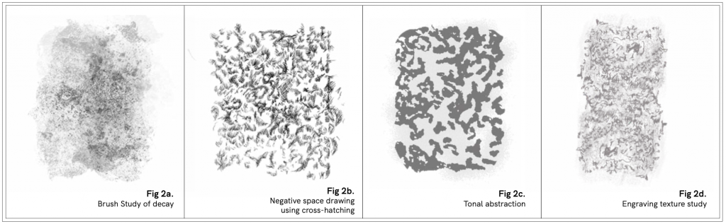
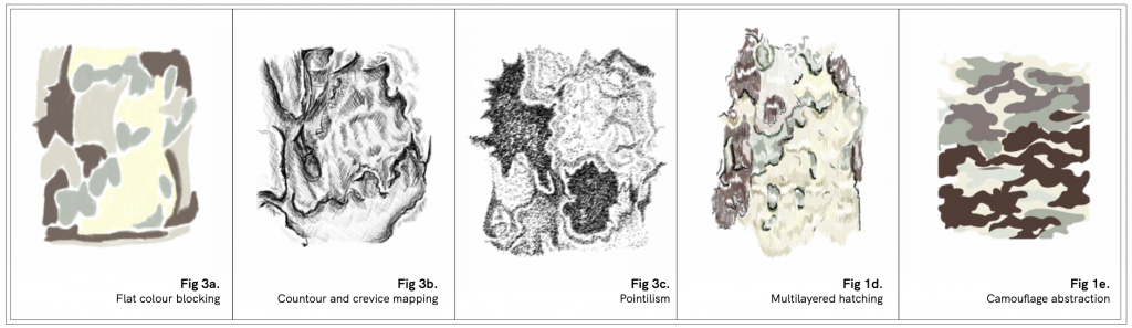
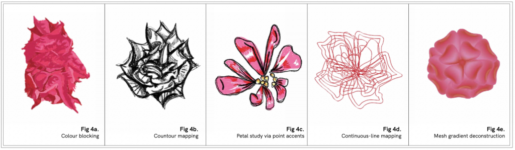
    Coming into Week 2, I started expanding my enquiry from simply mimicking IKEA diagrams to exploring how the logic of the manual could be stretched, broken, or reinterpreted to handle things it was never designed to explain. My Week 1 experiments showed me that IKEA’s visual language collapses when it tries to translate intangible concepts , and that collapse became the most interesting part of the project.

    This week was about pushing that collapse further.

    One of the biggest difficulties this week was realising that my project was pulling me in two completely different conceptual directions, and I wasn’t sure how to reconcile them.

    option 1: Tarot

    Tarot appealed to me because:

    • it’s ambiguous,
    • it relies on symbolic interpretation,
    • it invites intuition rather than instruction,
    • and it allows meaning to shift depending on the reader.

    Conceptually, tarot is the polar opposite of an IKEA manual

    option 2: self-help books

    When I looked into the language and structure of self-help books, they actually aligned surprisingly well with IKEA’s logic:

    • step-by-step improvement
    • emotional “fixing”
    • belief that following instructions leads to a better outcome

    This made the IKEA x self-help direction much more coherent than the tarot path

    At one point, I tried to merge tarot and IKEA into a single system (Which is why my manuals have names such as THE ALIGNMENT, echoing tarot’s major arcana such as THE FOOL), hoping the tension would become the point. Instead:

    • the ideas contradicted each other, the tone became muddy, and the conceptual foundation didn’t feel grounded. 🙁 I felt like I was stretching both systems too far away from what made them interesting in the first place.

    I therefore tried I started testing moving image, using simple animation and stop-motion to see how IKEA-style characters would behave when trying to assemble intangible things.

    I also played with tarot card formats, treating them like tiny instruction cards or symbolic diagrams to see whether a middle ground existed visually.

    At this stage, the project still feels inconclusive to me. The tension between the tarot direction and the IKEA/self-help direction hasn’t resolved into a clear path, and the experiments—while useful—haven’t yet shaped themselves into a cohesive outcome. I can see that I’ll need to change or refine parts of the project in order to reach an outcome that feels intentional and conceptually grounded.

  • Weeks 4-5 progress blog

    Week 4 (Week 1 of Methods of Cataloguing)

    This week I started looking at Andrew Garrett’s 19th-century fish illustrations via the Harvard Digital Collections.

    Honestly, my first thought was:
    “omg these are so cute”
    The colours looked soft, and the proportions were charmingly off.

    However … Once I started actually looking at the fish, the drawings shifted from aww cute to … these are kind of bad? Why did Harvard keep these?”
    The anatomy is inconsistent, the shading is stiff, and the colours are nothing like the real fish.
    This moment of going from affection → suspicion essentially kickstarted my entire enquiry.

    It made me realise that Garrett’s drawings were not just quirky mistakes; they were scientific documents treated as authoritative despite their flaws.

    These early experiments made me realise that the core of my enquiry wasn’t simply Garrett’s drawings, but the systems behind them:

    • the Linnaean taxonomy that categorized species through a Eurocentric visual logic,
    • the contrast with Indigenous naming systems, which are behavioural, ecological, and embedded in lived experience,
    • and the broader colonial circulation of knowledge, where specimens, drawings, and names travelled through networks that privileged European interpretation over local understandings.

    This clarity pushed me to deepen the project in the second week, shifting from playful interventions to a more structured investigation into how colonial science shaped our contemporary understanding of Pacific ecologies.

    Research

    I spent time reading Kris Manjapra’s chapter on science and colonial power, attached below. I didn’t expect it to influence my project so directly, but I ended up feeling very inspired by how clearly the text explains the relationship between Linnaean taxonomy, empire-building, and the circulation of “universal” scientific knowledge through colonial networks.

    Manjapra describes how European naturalists treated the world as a vast repository waiting to be catalogued, and how Linnaeus’ naming system became a tool for reorganising other people’s ecologies into a single European framework. This perspective helped me make sense of why Garrett’s drawings, despite being flawed, inconsistent, and often inaccurate, were still absorbed into institutional archives like Harvard’s and treated as scientific truth.

    Week 5 (Methods of Cataloguing Week 2)

    In Week 1, I was testing approaches such as recolouring, mimicry, language comparisons.
    In Week 2, these experiments started forming a clearer question:

    How can I re-catalogue Garrett’s specimens in a way that makes visible the tensions between Linnaean taxonomy, Indigenous naming, and the colonial pathways through which these drawings travelled?

    One of the first things I did this week was build a geographical map tracing where the specimens were collected, how they travelled via whaling routes, and where they became classified. From here, I initially wanted to make an interactive map/website whereby clicking on each collection point would lead to re-contextualised/re-catalogued information on said species.

    But as I kept working, especially after building the map and starting my case-study spreads, the project naturally shifted toward a publication format.
    The more I compared Linnaean names, Indigenous names, ecological behaviour, and Garrett’s formal inaccuracies, the more I realised that these layers needed to sit side by side on the page.
    The printed format allowed for slower, comparative reading, not just navigation.

    Even though the publication format made the most conceptual sense for the project, I wasn’t entirely satisfied with the visual outcome of the spreads at this stage. The content felt strong, but the visual system wasn’t as coherent as I wanted ; the typography and layout still feel slightly disconnected from one another.

    Because of that, I’m now actively working on strengthening the visual language of the publication: refining how the taxonomic comparisons sit on the page, reconsidering how much hierarchy I give to different types of information, and making sure the illustrations, maps, and language analyses feel like they belong to the same world.

    This is something I plan to keep developing so the publication doesn’t just function conceptually, but also reads visually as a unified, intentional re-cataloguing system.


  • Weeks 1-3 progress blog

    Week 1

    This week was my first proper investigation of St George’s Gardens. I didn’t go in with a fixed idea; instead, I tried to respond to whatever felt visually or atmospherically striking.

    When we were asked to choose a site, I actually picked this place because I didn’t like it. On my first visit, it felt strangely uncomfortable- quiet, but not peaceful, and visually caught between being a public park and a historical cemetery.

    That uneasy feeling made me curious. I thought that choosing a space I didn’t immediately connect with might push me to look harder and understand what, exactly, felt off. In a way, that discomfort felt like an invitation. If Perec urges us to look at what is so familiar that we don’t see it anymore, then I decided to do the opposite: look at what felt so unfamiliar that I wanted to look away.

    Initial Methods

    • Observation & close-up documentation: I walked slowly around the site, photographing details, surfaces, and any interactions happening in the space.
    • Sketching: I made on-site sketches to get a feel for forms, shadows, and textures. Even though the drawings weren’t polished, they helped me notice things I would have ignored in photos.

    Week 2

    This week I returned to St George’s Gardens with the intention of pushing my observations further. After reviewing my Week 1 work, I realised that textures were becoming the strongest entry point into the site, so I began exploring them at two scales: macro (the wider forms) and micro (the fine details that make up those forms).

    How This Shifted My Enquiry

    The macro/micro studies made me realise that the garden operates on multiple temporal scales too:

    • Macro = slow change (stone wearing down, trees expanding)
    • Micro = constant subtle motion (grass bending, bark peeling, flowers opening/closing)

    This deepened my interest in how textures reveal time passing. The garden isn’t static.. it’s made up of tiny changes happening continuously alongside slower, heavier forms of change.

    Developing My Method

    Through this week’s drawings, my approach became more structured:

    • observing the site →
    • zooming in/out through drawing →
    • noticing patterns that only appear when switching scale.

    I also became aware that drawing itself is my method of “seeing,” not just recording.

    Week 3

    This week I brought together everything I explored in Week 1 and Week 2 and developed a more intentional body of drawings. What started as discomfort with the site has now become a much clearer enquiry into how the textures of St George’s Gardens reveal different rhythms of time, decay, growth, and coexistence.

    Instead of treating the garden as a single space, I now see it as a collection of materials, each with its own logic, pace, and “voice.”
    To explore this, I created a set of texture studies, almost like a small field guide, using multiple drawing techniques.

    By Week 3, my relationship with the site had completely changed:

    • The garden isn’t a space of death; it’s an ecosystem constantly renewing itself.
    • I no longer felt unsettled by it; instead, I understood why it felt ambiguous.
    • The discomfort came from the coexistence of different temporalities.
    • Drawing helped me see these hidden dynamics, and became my main method of enquiry.

  • Unit 1: Methods of translating written response

    This project re-presents Walter Benjamin’s The Work of Art in the Age of Mechanical Reproduction through the stylistic framework of Raymond Queneau’s Exercises in Style.

    By rewriting Benjamin’s argument in multiple everyday genres, it performs the very process Benjamin describes: repetition transforming meaning. Each restyling erodes the “aura” of the original text while generating new value through variation, asking whether intellectual originality, like artistic authenticity, can survive the age of endless reproduction.

    References:

    Benjamin, W. (1986) The Work of Art in the Age of Mechanical Reproduction. In: H. Arendt (ed.) Illuminations. Translated by H. Zohn. New York: Schocken Books, pp. 219–253.

    Queneau, R. (1998) Exercises in Style. London: John Calder, pp. 9–16, 19–26.

  • Unit 1: Methods of cataloguing written response

    The Sealand chapter of Uncorporate Identity examines the Principality of Sealand as a case study in how statehood and identity can be constituted through external infrastructures rather than political or territorial fact.

    Situated on a disused sea fort, Sealand lacks formal recognition, governance, and territorial legitimacy, yet it presents itself as a sovereign state through flags, passports, stamps, and online narratives. By analyzing how Sealand’s identity is mediated by interfaces and collective imagination, Metahaven reveals the mechanics of recognition and the performative nature of sovereignty in a networked era.

    I therefore attempt to frame Sealand through the language of metadata rather than narrative. Using a retro OS interface, each conceptual element in the reading is treated as a discrete file, mirroring how Sealand’s identity exists through external infrastructures like search results and documentation. The interface becomes the ‘outside’ that gives form to an otherwise empty state.

    References:

    Velden, D. van der and Kruk, V. (2009) Uncorporate Identity. Baden: Lars Müller Publishers; Springer (distributor), pp. 19–49.

  • Unit 1: Methods of investigating written response

    St George’s Gardens is an unassuming park that sits at the crossroads of Greys Inn Road, Sidmouth Street, and Handel Street. It is in a constant state of flux; brisk walkers cut through it, dogs sniff their way around, birds and insects animate the air.

    It is also a cemetery.

    This duality unsettled me at first, so much so that I would hold my breath walking past the gravestones, willing myself to ignore their existence. As I began to investigate the gardens through drawing, however, I found that this space invited a slower, more porous way of seeing.

    I tried in my process to mirror Georges Perec’s approach to observation. In ‘The Street,’ Perec (1997) proposes a method of inquiry rooted in attention to the seemingly banal, things we often overlook precisely because they are always there. “Carry on [classifying] / Until the scene becomes improbable,” he writes, “until you have the impression, for the briefest of moments, that you are in a strange town or, better still, until you can no longer understand what is happening or is not happening” (p. 53).

    My own investigation followed this principle: by drawing and redrawing textures: grass, bark, stone, flower, through different visual techniques (pixelation, hatching, gradient mesh, etc.), I began to notice what I had previously dismissed.

    Grass, for example, became not just a backdrop, but a constant host to footfall, decay, and regrowth. Stone, once a marker of death, revealed itself to be alive with moss, weathering, and time: a surface of accumulation, rather than absence.

    Through drawing, I realised that these were not just static materials, but living surfaces, each carrying their own entanglements with the environment.

    My voice throughout this process has been observational, much like Agnès Varda’s in The Gleaners and I (2000).

    Varda wanders and collects, lingering on the discarded and the overlooked with intimacy and curiosity. My project shares this ethos. Rather than the obvious connotations of death associated with a cemetery, I focused on what is alive now: a weed cracking through pavement, a bloom softening a gravestone, the way bark sheds and renews.

    In doing so, I reframed the cemetery not as a static space of remembrance, but as a living ecosystem in flux. My project became a culmination of that shift in perspective, and ultimately, a record of how perception can be changed by the act of looking more closely.

    References

    Perec, Georges, (1997) Species of spaces and other pieces,
    London: Penguin Books Ltd

    The Gleaners and I. (2000). France: Ciné Tamaris.